
Clarity Sans
Hannah Hamid
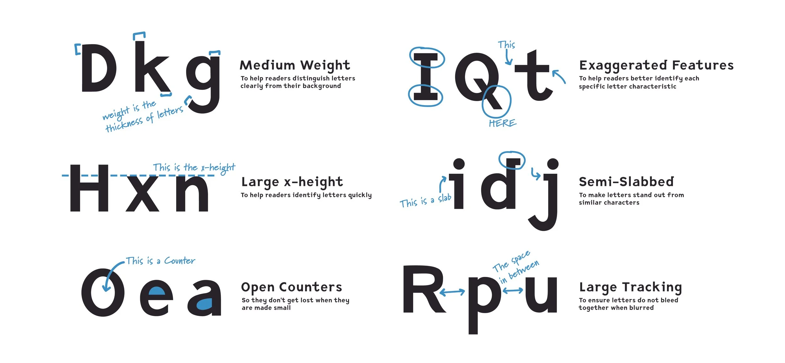
We often overlook some of the more banal applications of design, even in something as seemingly mundane as the fonts we encounter. But what about those elderly couples leaning in together over their phones in dimly lit restaurants around the globe? If the text on the phone is illegible, suddenly the debate about inclusion and ableism takes a new form. Are the most common fonts we use prohibitive for those with difficulty reading? Do they prevent different types of people from using their phones in a meaningful way? For instance, HOW DOES IT FEEL WHEN YOU READ TEXT IN CAPITAL LETTERS? Most can agree that a simple shift in the letters can entirely change the meaning.
Designer Hannah Hamid has always had a recurring desire to use design as a tool for positive change in communication. She decided to address the root problems with typeface legibility through Clarity Sans.
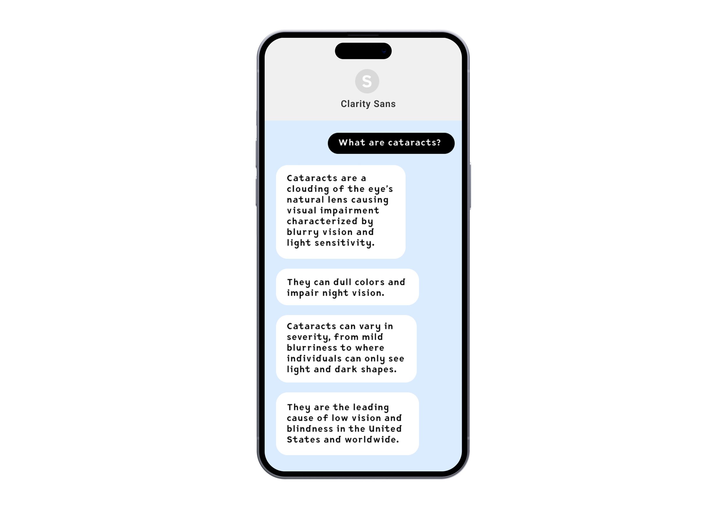
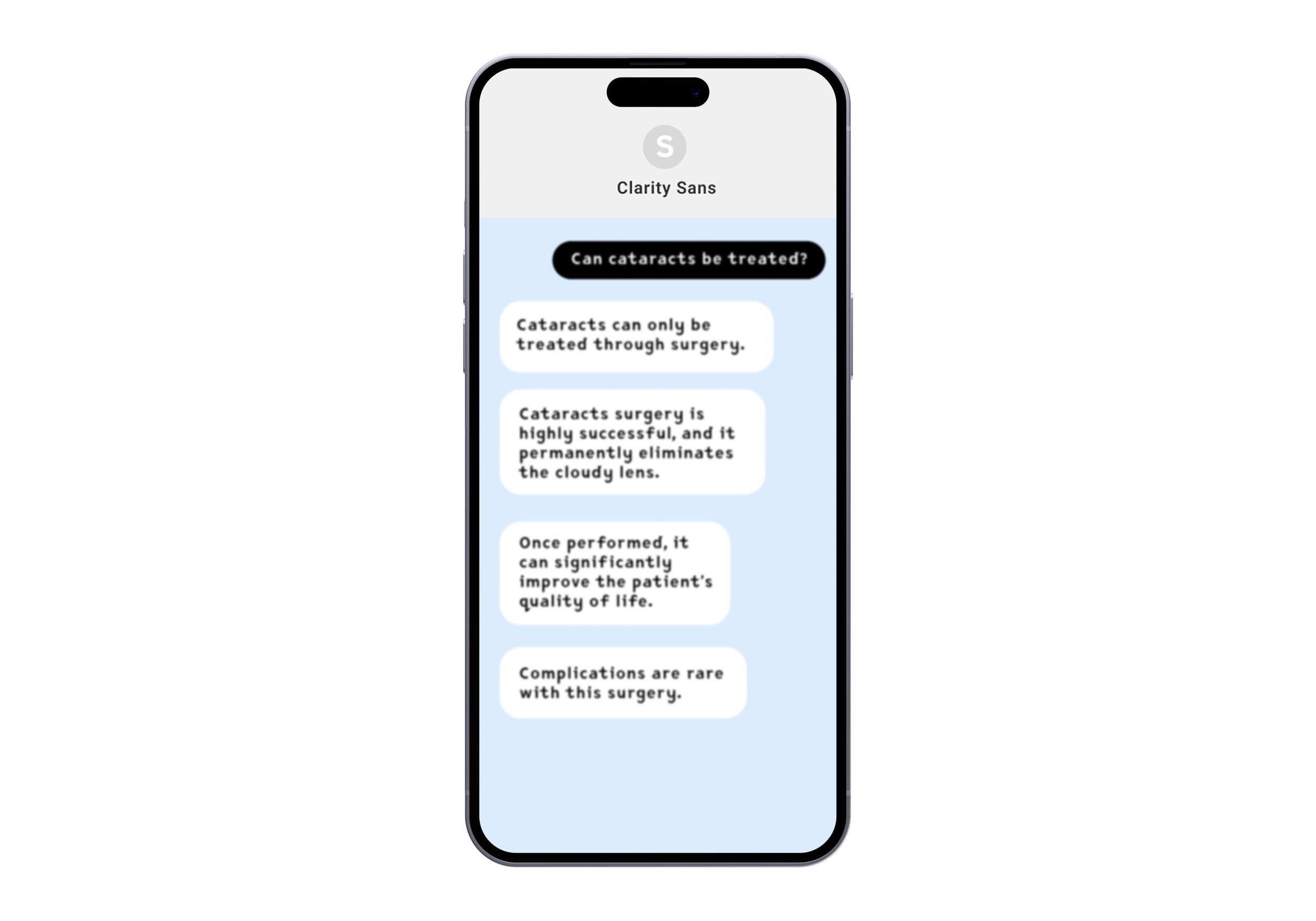
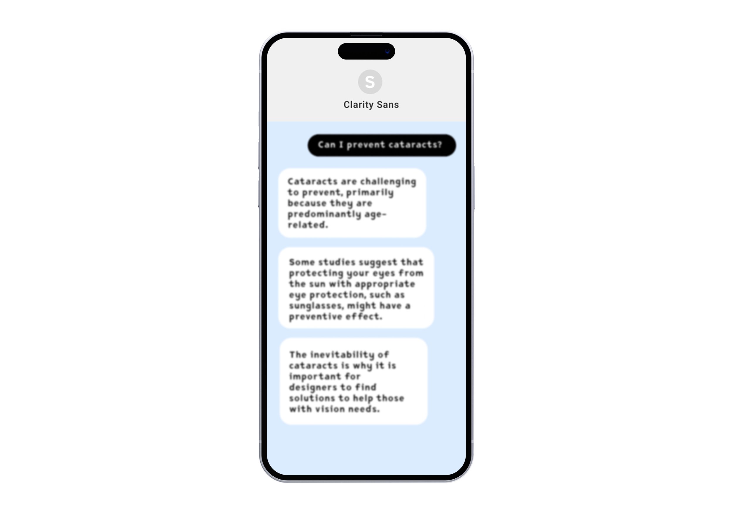
Clarity Sans offers a solution for the lack of accessibility in mobile devices for individuals with cataracts. According to the CDC, 4.2 million Americans 40 years or older are legally blind or have low vision. As people age, they will almost certainly develop cataracts — a vision impairment that causes the eye’s lens to become cloudy, resulting in blurred vision. It is a challenge for those affected by visual impairments to navigate their devices and read information, especially when the text size is small. This is a concern for all of us as we grow older. Clarity Sans is an effective solution because it has distinguishable letters, including extra space in and around the shapes. By enhancing the characteristics of each letter to differentiate them from one another, Clarity Sans is legible for users with cataracts.